Have you tried Houzz?

Original Ideabook

IdeabookOriginsWaterEarthWindFire.Com01

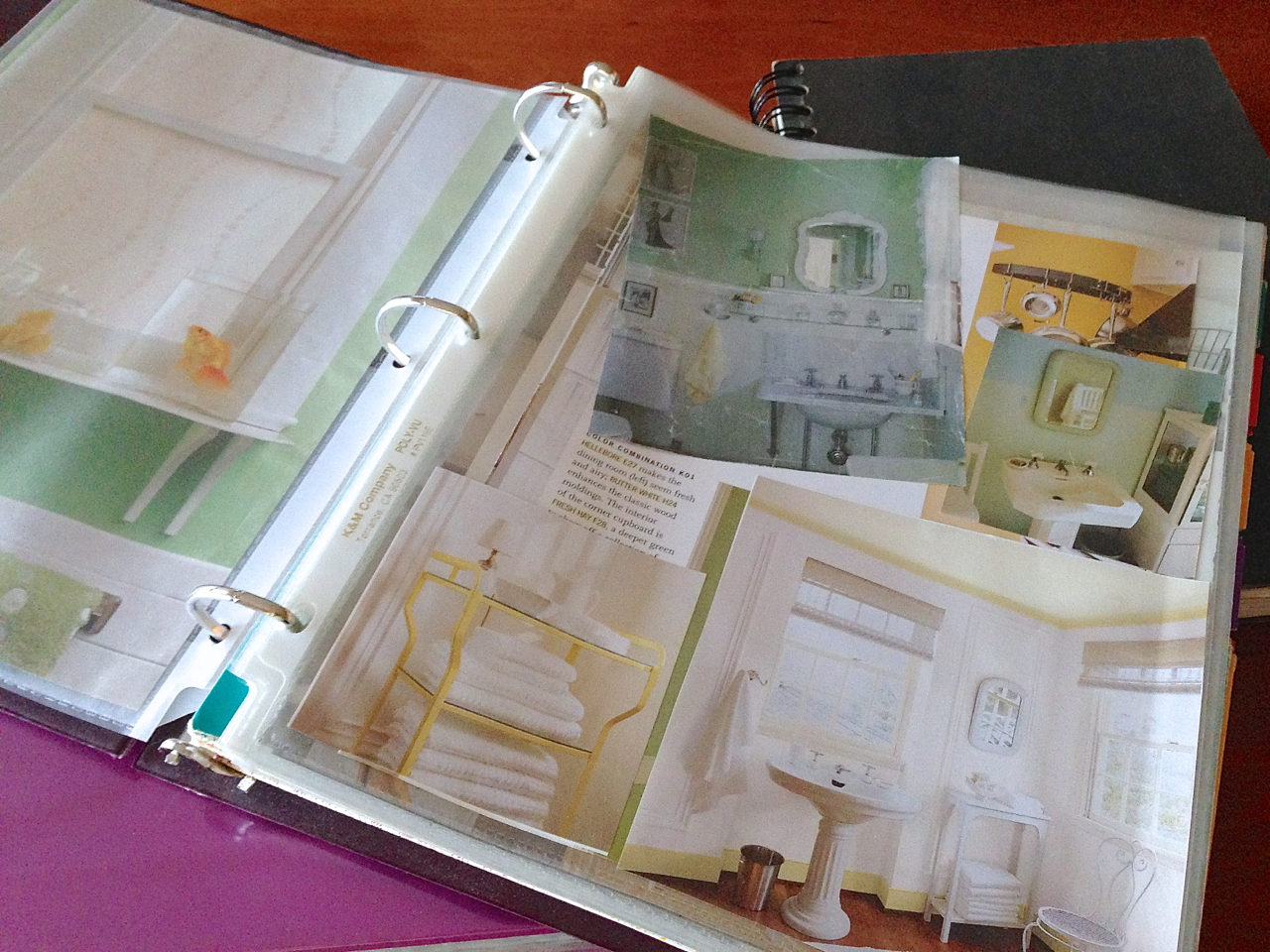
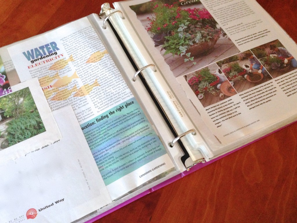
Once upon a time, long before there was Pinterest … before there was Houzz … before there were so many ways to bookmark and share your ideas on the web instantaneously and effortlessly … there were ideabooks: binders with plastic sleeves for saving magazine clippings and writing down our ideas for our remodeling projects or our dream houses.

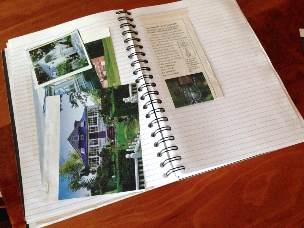
And before binders with plastic sleeves, there were notebooks and style-boards– for collecting bits of fabric, paint samples, drawings (remember hand drawing?) of furniture styles and window treatments, decks, patios and container plantings. We made notes with hand lettering, detailing why we liked a certain photo of a room (the wall color, flooring or light fixtures… the way the light streamed in from large windows, or the cozy reading nook) or where we would buy that Persian rug or dining room set.

Origins of the Houzz Ideabooks -- Analog Ideabooks

Designers used ideabooks long before Houzz existed. They made style boards to present to their clients. They often asked clients to clip and save their own ideas, gathering them into ideabooks that would help the client and designer be on the same page when it came time to narrow down things like color, materials, style.

I love Houzz. I really like using Pinterest too, though I try not to get too sucked in to the Pinterest vortex. It can be a huge time waster if you aren’t careful. Houzz has made architectural, garden and interior planning so much easier. And easier to share with others.

IdeabookOriginsWaterEarthWindFire.Com03

When I work with a landscape design client, I often ask them to open a Houzz account to share their ideas with me. They can also browse around my Houzz ideabooks to get a feel for my signature style, as well as other styles they might like to consider. It sure beats buying alot of garden magazines and cutting them up, then wondering what to do with the remains!

IdeabookOriginsWaterEarthWindFire.Com04

Houzz is specifically set up to gather ideas when you are planning a remodel, refurnishing or redecorating your home, or designing new construction. I’m pretty sure the Houzz founders used designers’ ideabooks and style boards as the basis for their online format.

IdeabookOriginsWaterEarthWindFire.Com09

On Houzz, you make ideabooks remarkably like analog ideabooks. You can “clip” images to your ideabooks as references or inspiration. You can have multiple ideabooks, based on function (lighting, flooring, layout) or by room (kitchen, bath, bedroom, garden.) Your imagination is the limit.

Clip images from anywhere on the web to your Houzz ideabooks, or just browse other people’s Houzz ideabooks and clip images directly from theirs into your own. It’s a great way to share ideas with people you know, with strangers who have similar taste, and with your architect, landscape designer, or interior designer. It’s also a fun way to collaborate with others who involved in your project such as family members and friends.

You can keep your ideabooks private or make them public. When you comment you can mark your comment as private if you like. How much you share is totally up to you.

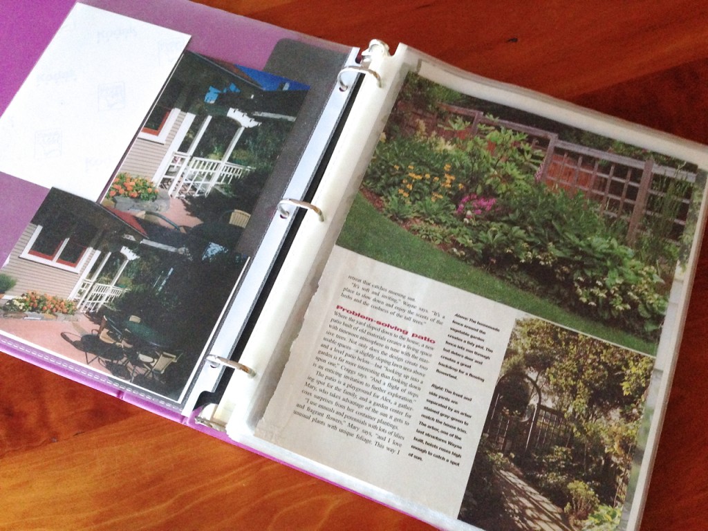
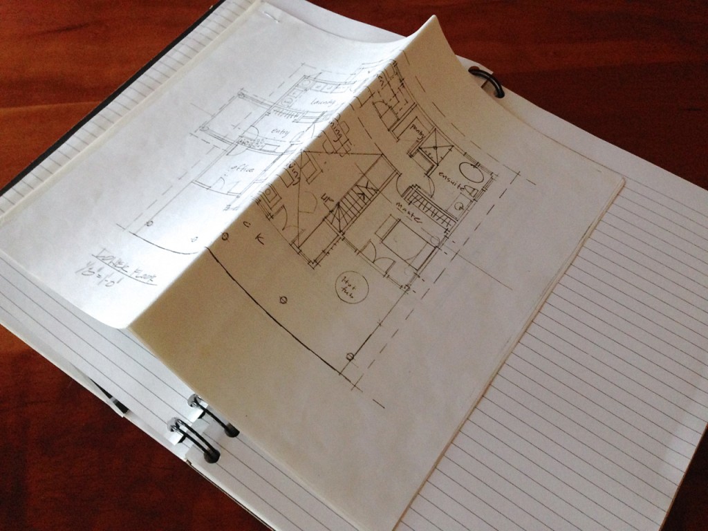
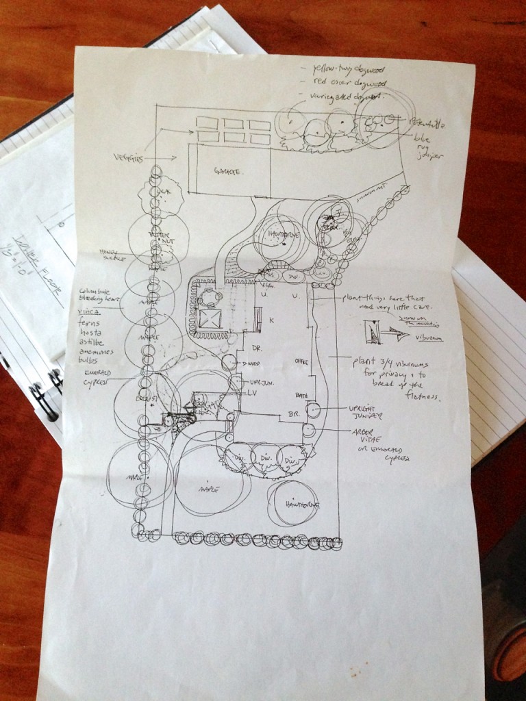
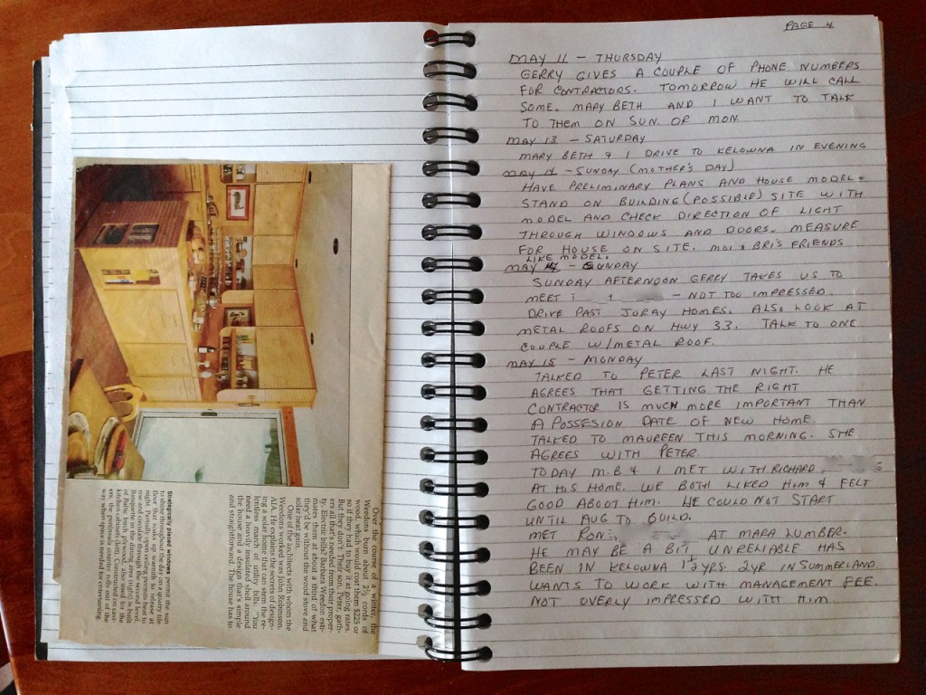
The photos in this article are my mother’s analog ideabooks from a few years back when she was designing a new house with my architect sister, Marybeth, and her landscaping with me. Mom involved all of her kids in the design and planning process, as you can see from her very detailed diary of the planning process.

In fact, now that I think about it the ability to keep an online diary or calendar of planning/design/construction right on one’s account might be a good idea for Houzz to develop. It would make a great record of what you and your contractors did during a project … and could be shared with others as an example of how a home project might evolve.

Origins of the Houzz Ideabooks -- Analog Ideabooks Origins of the Houzz Ideabooks -- Analog Ideabooks   IdeabookOriginsWaterEarthWindFire.Com05

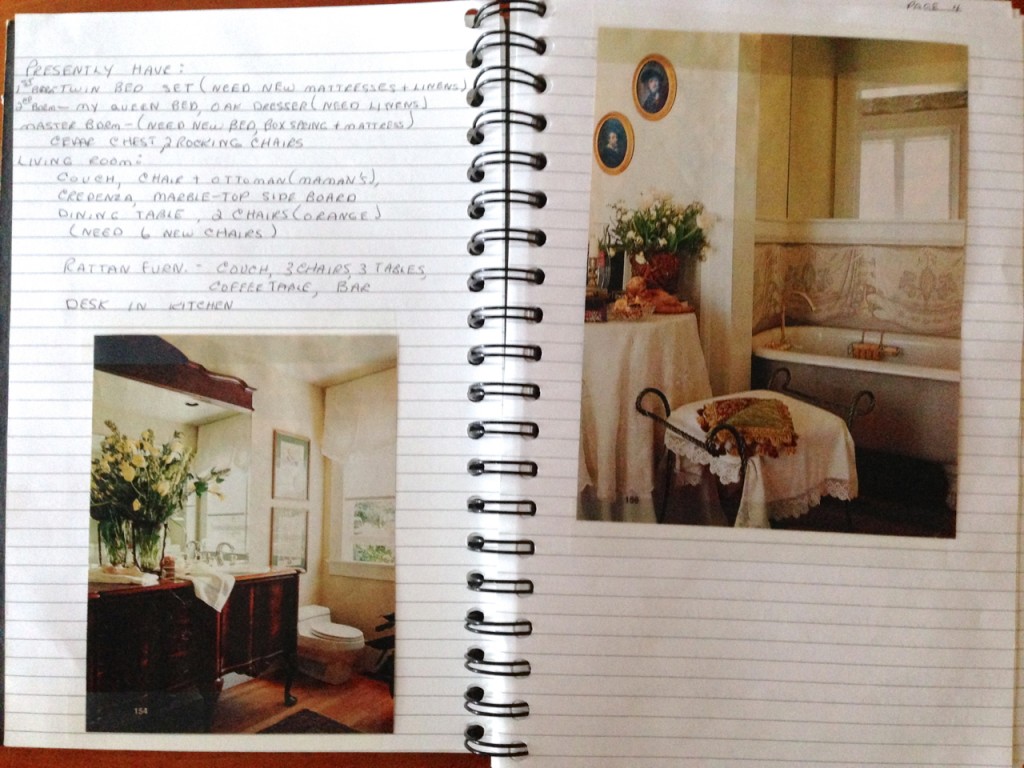
It’s always a good idea to take an inventory of what you already have whether you are designing a remodel or new construction. Especially now when we are all trying to simplify and live more conscientiously, it pays to design around the big things you already own. Mom did that when she was designing her new house, below. She also included clipped photos that showed ideas of ways she could use her present furniture in the new house.

IdeabookOriginsWaterEarthWindFire.Com07

Okay, enough about ideabooks. I think you have the idea of how Houzz originated their format. Now, go explore Houzz if you don’t already have an account and I hope you sign up, even if you don’t have a project in mind right now.

You might start with an ideabook for next year’s gardening season … or just for fixing up one room in your apartment in simple ways. Start a color ideabook, or a wall-decor ideabook (clip ways to frame art, ways to display artwork, and artwork you like) It’s always fun to dream and imagine!

Check out my ideabooks. Here are links to some favorites:

Other Links about style boards and ideabooks
Wood, Trees and the Spirit of Nature

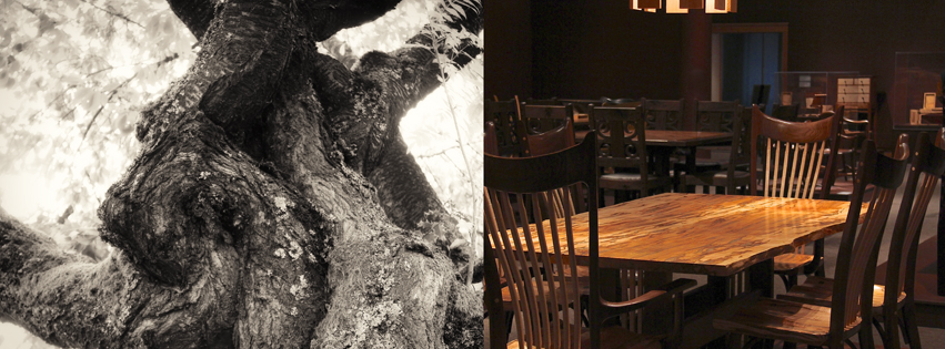
Photo of Cherry Tree - Dining Set by Tim Carney

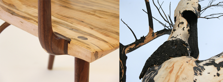
Dining Chair by Tim Carney - Photo by Maureen Shaughnessy

1+1=1 is becoming a reality! On November 8th our little month-long gallery will have an opening reception during the Helena Fall Art Walk. The reception is from 6 to 9 pm.

Photo of Cherry Tree - Dining Set by Tim Carney

The idea of 1+1=1 began when my husband, Tim and I were talking with our friends Mike and Colleen over dinner at their house. We were asking them how they helped Doug Turman get his start as an artist and gallery owner and Mike told us about the popup gallery he and Doug had years ago. Now Doug and his lovely wife, Mary Lee, have the always-happening Turman Larison Contemporary (art gallery) in downtown Helena. And it just so happens that the place we found for our popup gallery is right next door to Doug and Mary Lee’s gallery. Awesome!

We have been wanting a place to show Tim’s studio furniture and my photography and paintings for a long time, and the idea of experimenting with a temporary gallery was enticing.

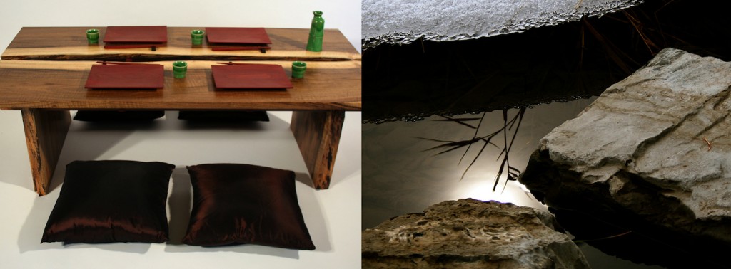
Sushi Table and Day's End

So we’re doing it! We found an empty retail space on Last Chance Gulch and Mike helped us arrange a deal with the owners of the building for just one month to try out this gallery idea. It’s pretty last minute because we wanted to have our opening during the Art Walk, and be open for the holiday shopping season before Christmas.

Desk and Burn Color

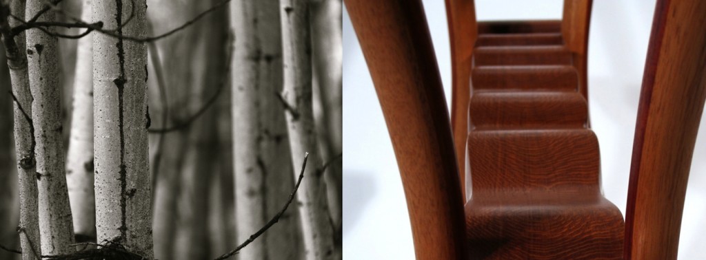
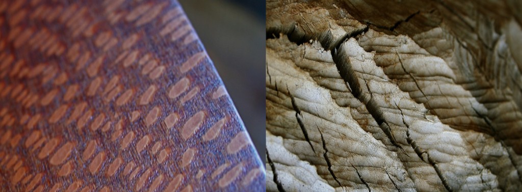
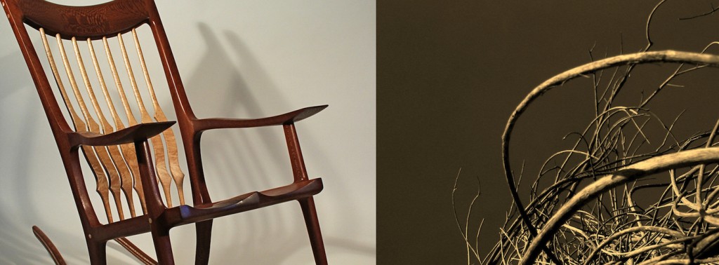
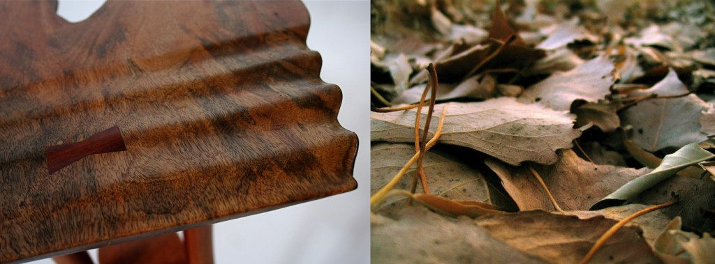
Tim and I share a common esthetic and creative vision, although we have very different ways to express that vision. He works with the spirit of trees through his hands, making functional art furniture. I express my connection with trees and nature through photography, painting and mixed media collage. Our home is filled with art from both of us and our friends and family. We live a blessed, simple life and we both feel lucky that we can make a living creating art that we hope helps others connect with Nature on a deep level.

AspenTrunks-YellowstoneDetail-imp

DreamtimeBeaver-imp

Rocker-PoemGesture-imp

YellowstoneRipples-ForestFloor-imp

Desk and Burn Color

Sushi Table and Day's End

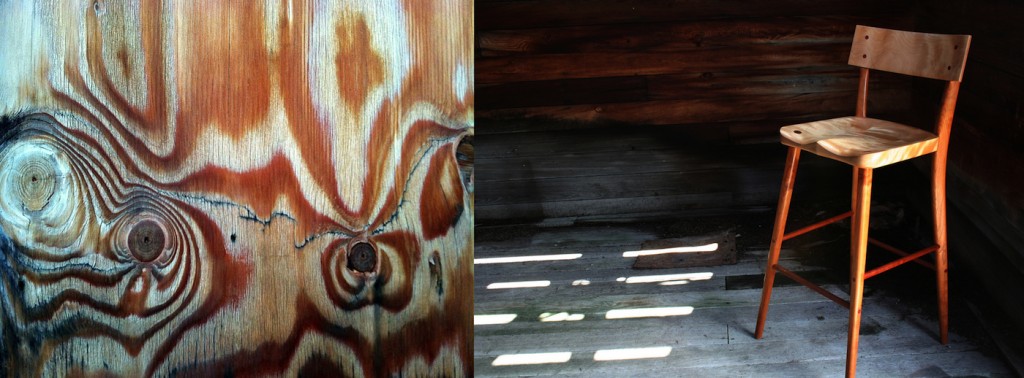
Stool-Texture-imp

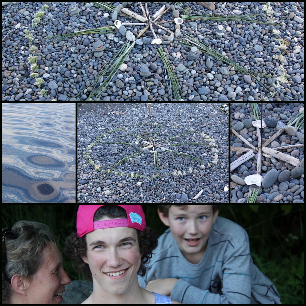
Ocean Mandalas Use Found Natural Materials

Ocean Mandala with natural objects
Making mandalas from natural objects you find on-site can be a playful or a quiet meditative activity.

At our family reunion on Vancouver Island this past weekend, some of us made mandalas of shore materials we found in the forest and on the beach. Natural object mandalas are– by their very nature — ephemeral, and will be destroyed by the tides, wind, wildlife and time. Yet the making of these circular designs gives so much pleasure it doesn’t really matter that they won’t last long.

Mandala of Natural Objects
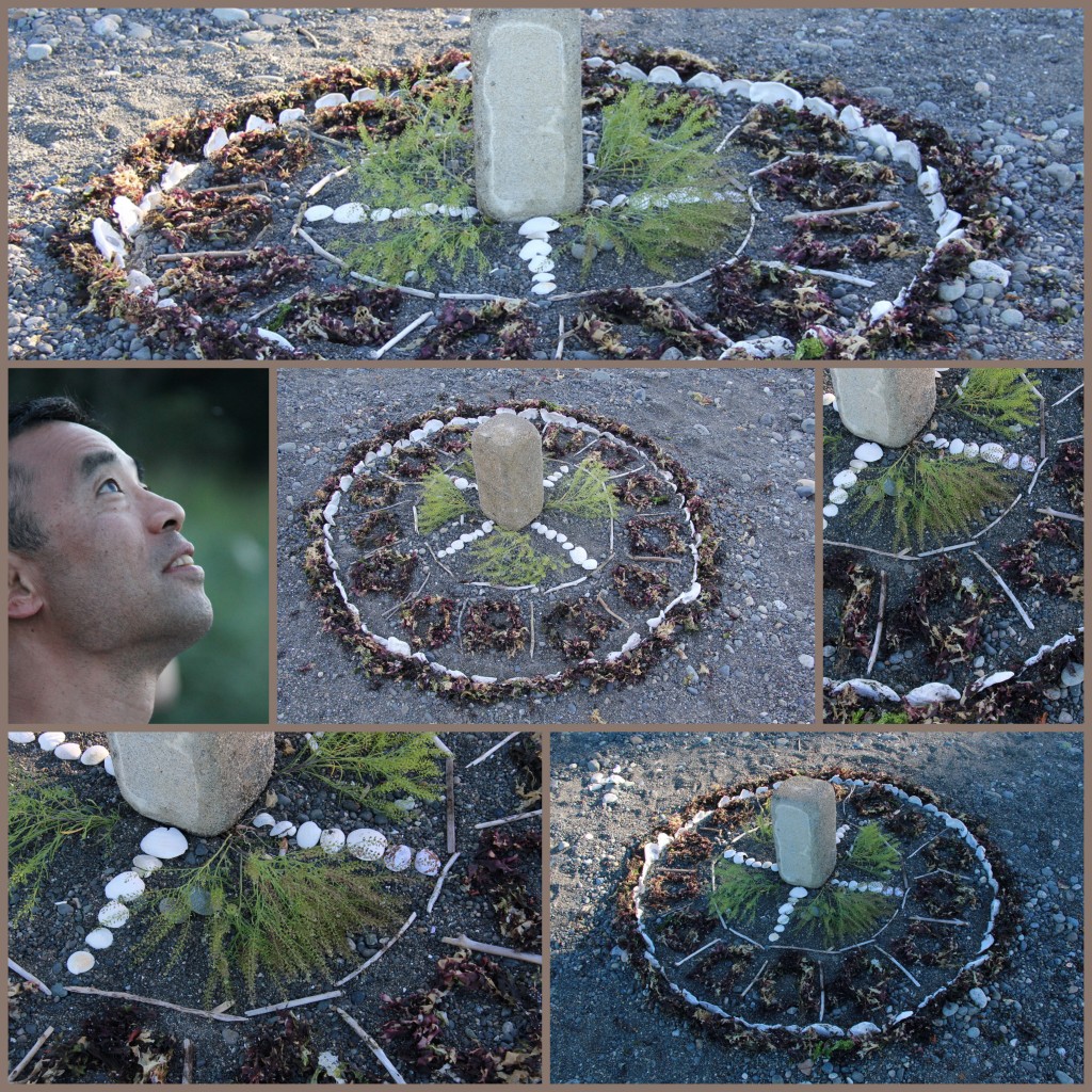
Tom and Kat made this mandala using a barnacle-covered cinder block monolith, red seaweed, driftwood sticks, oyster shells on-edge, and some wild mustard.
Ocean Mandala of natural objects
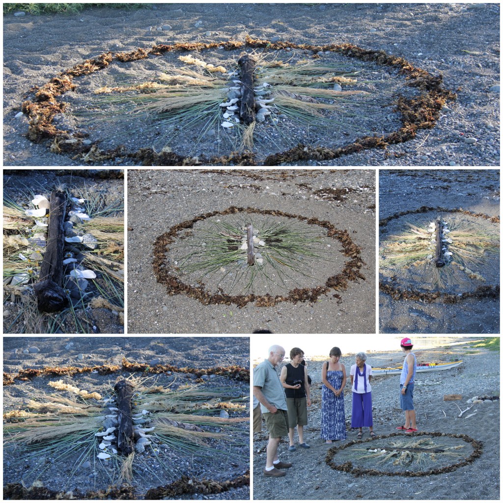
Martina’s mandala has bilateral symmetry, and includes a border of seaweed, and in the center, she used driftwood, grasses and shells

As the evening cooled, we walked around admiring the mandalas … then later watched as Tom and Kat’s mandala was washed away by the incoming tide. I love thinking of beach-walkers stumbling across our mandalas and wondering about the makers. I hope these photos inspire you to make your own mandalas, no matter where you are.

Ocean Mandala of natural objects
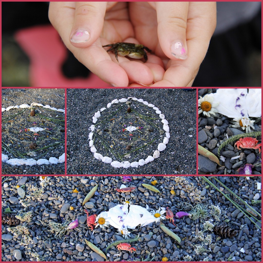
Amy and her family made this sweet circle filled with offerings from the sea… tiny crabs, shore plants, seed pods, flower petals, shells and little bits of driftwood.
Ocean Mandala of natural objects
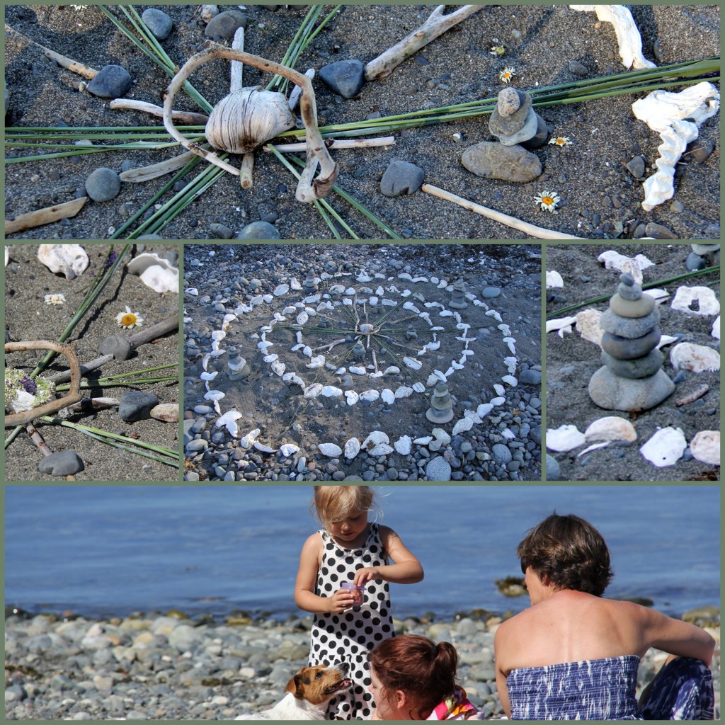
Margie and daughters created this wonderful mandala with concentric rings of seashells, plus driftwood, stone towers, flowers and leaves.
Ocean Mandala of natural objects
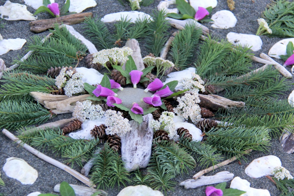
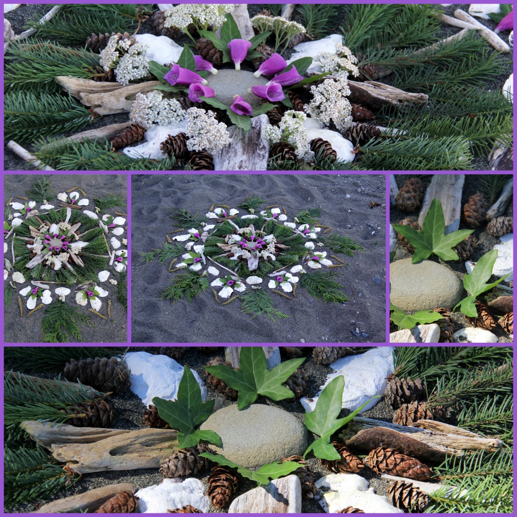
Tim and Maureen created their mandala with oyster shells, douglas fir cones, ivy leaves, foxglove, yarrow, driftwood, fir and cedar boughs.
Ocean mandala of natural objects
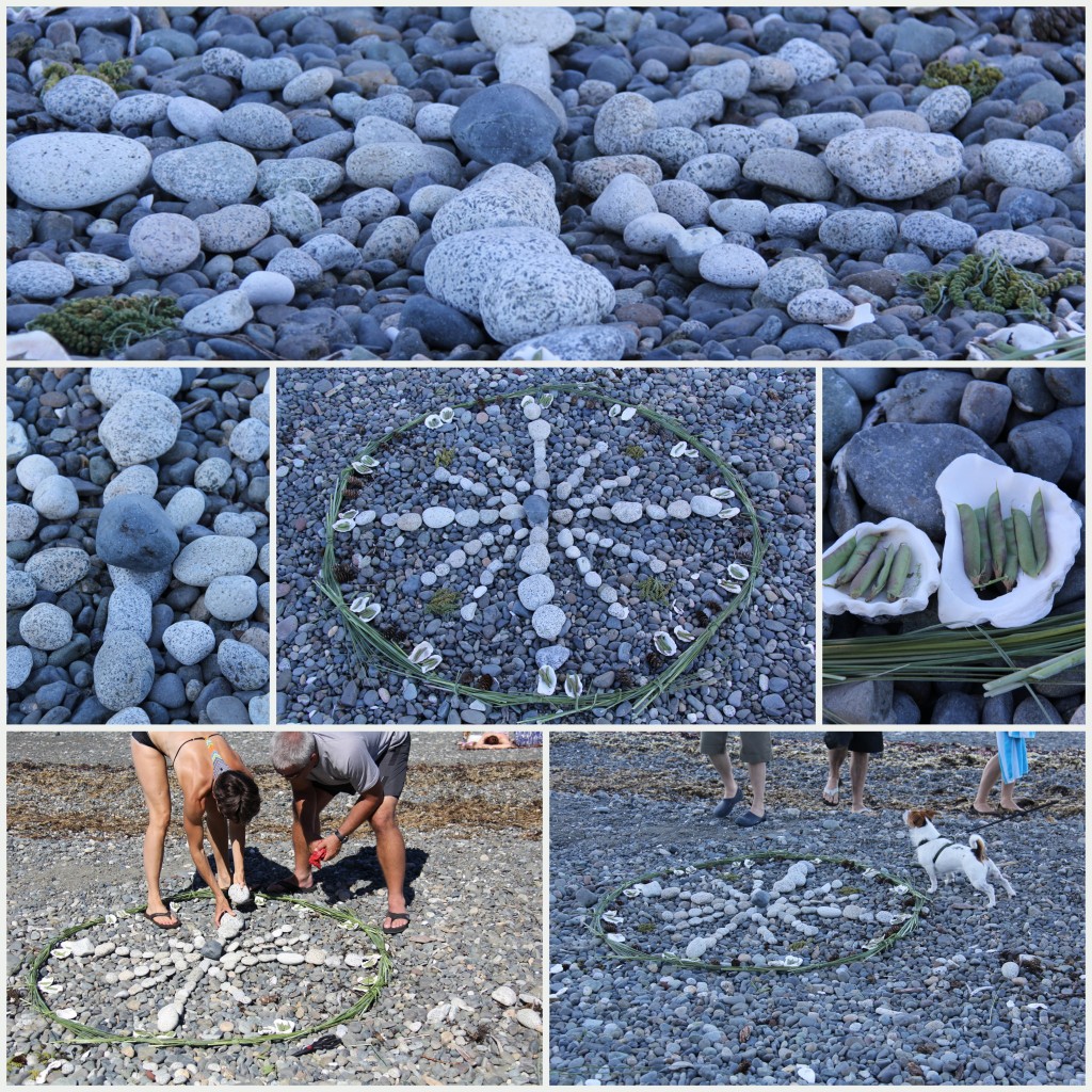
Moira and Brian worked side by side to creaste this stony mandala on a bed of beach stones… they chose lighter colored stones to contrast with the dark shore, and added shells, seed pods, and grasses tied in bundles as a circular boundary.
Ocean Mandala of natural objects
Marybeth and Sons …. played and worked together to create the most subtle of all the mandalas. They used stones, driftwood, shells, yarrow and shoreline grasses.


Water Features in the Garden: How to Visually Connect Them

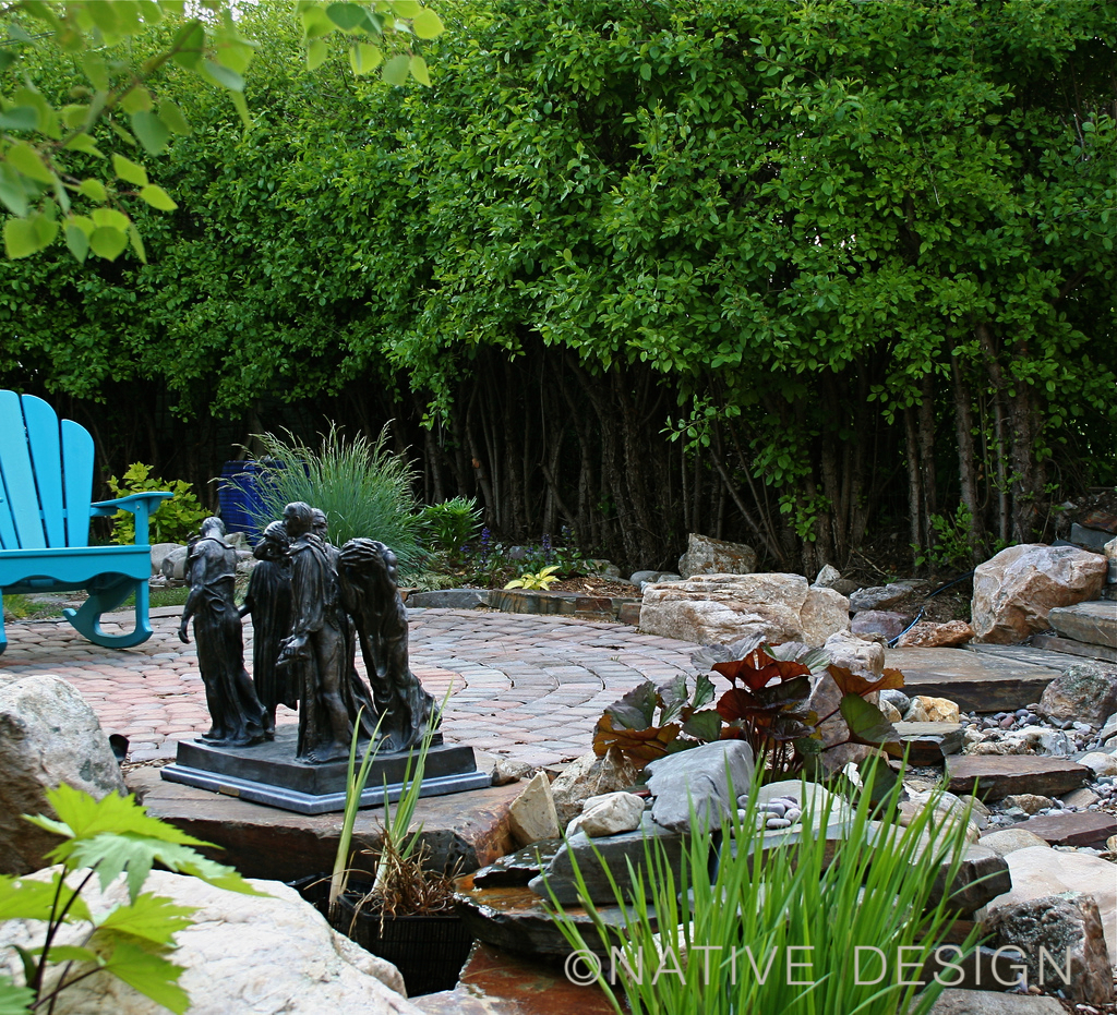
dry stream and sculpture in garden

dry stream and sculpture in garden
Garden features such as urns, ponds and small flowing streams can add to your enjoyment of the garden as well as connect the different parts of your garden together.

Here is an example of an outdoor room with two water features. The water features — a flowing urn and a pond — are separated by a distance of about 25 feet in this garden. We needed a design solution to visually connect them.  The garden’s pond is located next to a low deck and appears to extend under the deck. The second water feature is an overflowing urn fountain on the other side of the small garden (in the photo above, look for the blue urn, barely visible behind the ornamental grasses.) The water flows over the rim of the urn and disappears into a hidden reservoir under the container. We wanted to visually and psychologically connect the urn fountain with the small garden pond as well as solve a drainage problem. 

Our solution was to build a dry stream bed using the same stones we used in the pond and around the urn. The dry stream gives an illusion of flowing water and in the imagination and mind of garden visitors, the urn is a perpetually flowing source of clear fresh water for the pond.

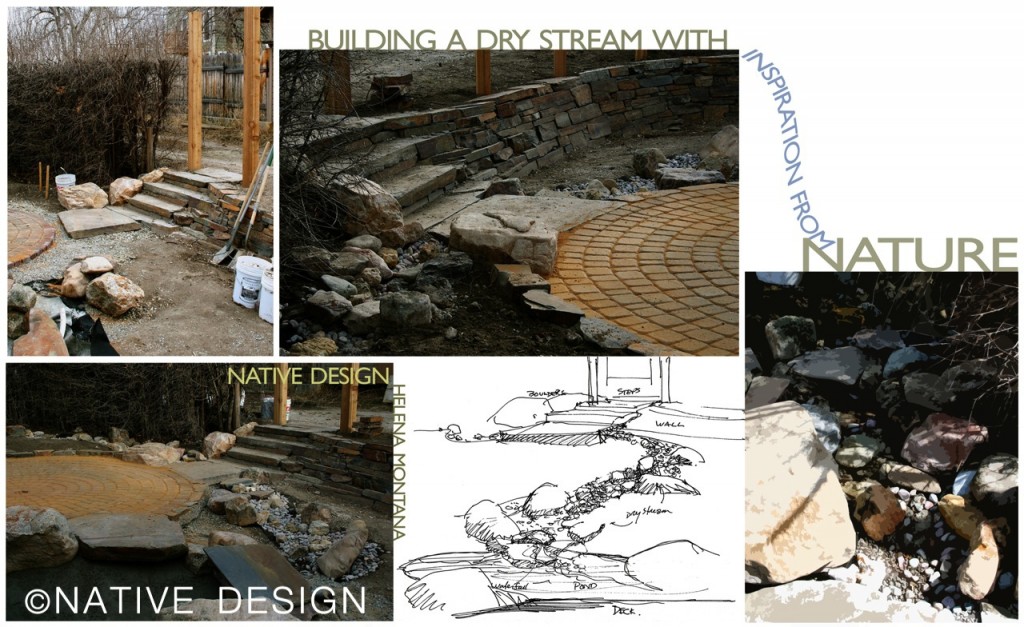
In order to fool the eye and create as natural-looking a stream bed as possible, I took my inspiration from the way bedrock, boulders and cobbles come to rest in a mountain stream. Too many times when folks attempt to create a dry stream bed in their landscaping it results in something that looks very unnatural — or worse. The tendency people have is to dig a swale or channel; line the edges with large rocks and fill the center with smaller river rock. That isn’t the way river dynamics form streams in nature.

howtobuildadrystreambed

In the center of the above montage, you can see the rough sketch I made before we started construction. It’s almost impossible to design the exact layout of water features, when working with boulders and other natural materials.  Fortunately I was able to stay involved in the construction process to make sure the final results matched what was in my head. I also owe much of the credit to the contractor who installed the water feature — he was sensitive to the same forces of nature I observe, and we worked well together.

If you want to design water features in a “natural” style, consider water’s natural behavior — particularly the way water affects the environment through which it flows. Take a hike in the mountains and observe the way gravel and cobbles fill the nooks and crannies between boulders lin a tumbling mountain stream. Gravel is lighter than boulders, so it is picked up and carried by water more readily than the larger stones. Spring runoff and high flows are strong enough to move boulders so these are shifted until they get stuck in a tumbly looking pattern. If you live in a valley — there may be natural water features you can imitate.  A stream or river can give you design clues in the shape of the meanders, the oxbows, the inner and outer curves and how the banks are sculpted by the flow.  Where are the large rocks, if any?  Where is the gravel deposited and is it all the same size?

What other garden features might benefit from an observation of nature in the design process?  Ponds, boulder benches, stepping stones and other pathways, terraces, stone walls, even steps leading from one garden level to another. These will be topics in at least one future post so check back for more design inspiration.

Links that might help with designing garden features in a “Nature Inspired” style:

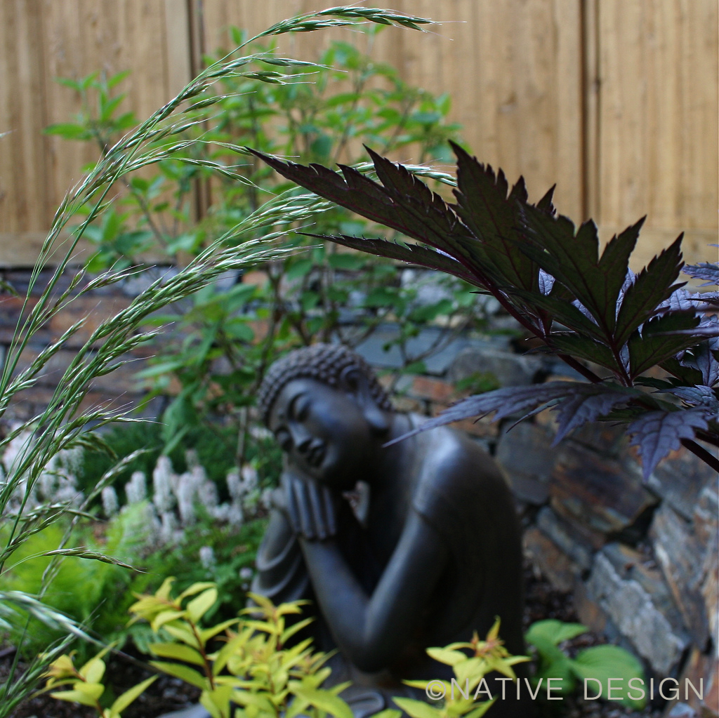
Garden Buddha in Dry Stream Garden

Here are some more photos from this garden installation and it’s first year. There are several nature-inspired garden features in this small private landscape project including dry-laid stone walls, shade structures, a wandering stepping stone pathway, boulder benches and a total absence of lawn. Click on any of the photos to see a larger version. Enjoy! And please comment if you have any questions about your own water feature. Thank you for reading!