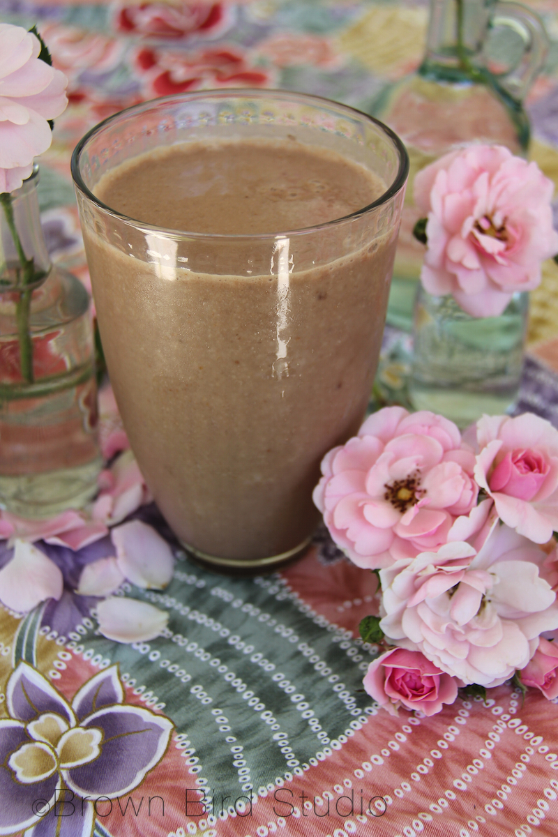
Saturday Smoothies: Chocolate (non-diary) Cream
Water :: Earth :: Wind :: Fire
Art and Art Education with the Elements
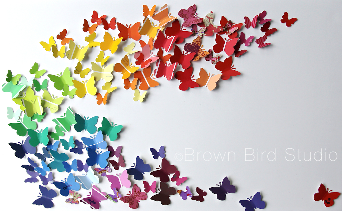
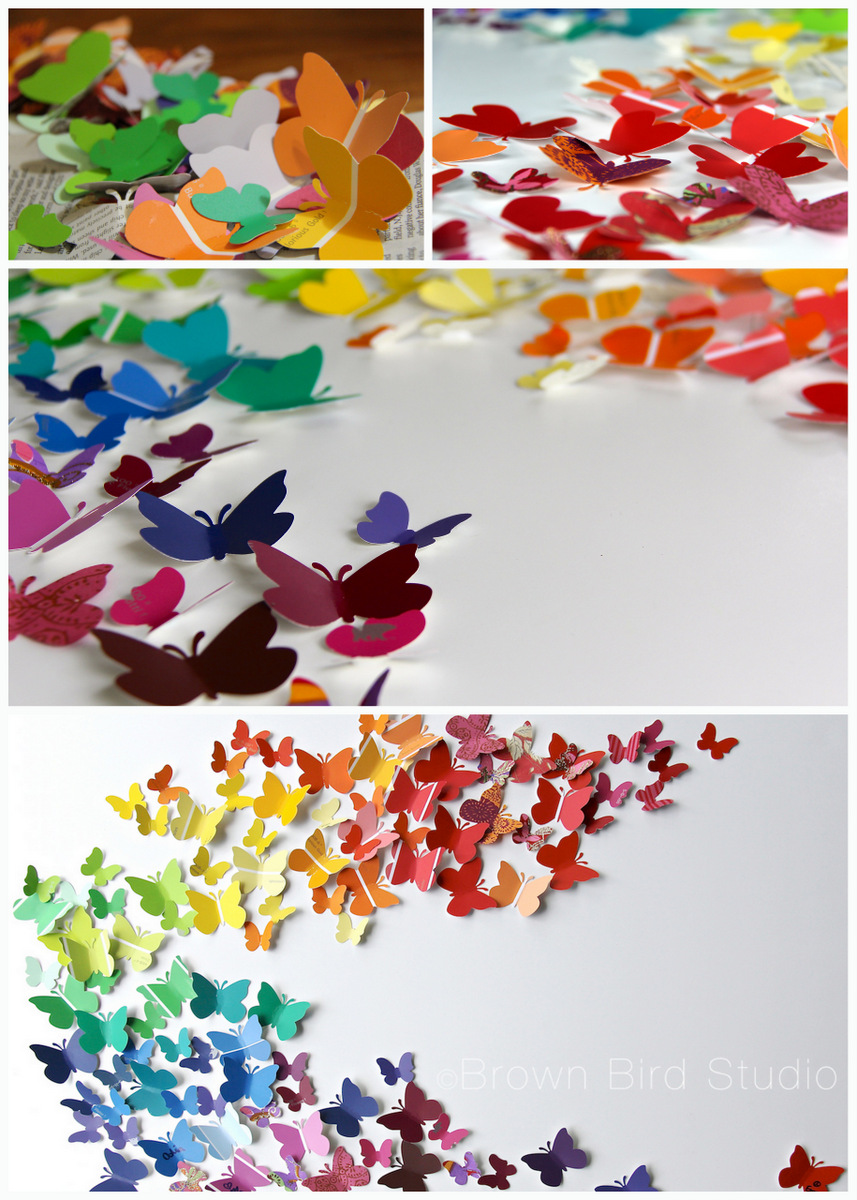 One of the projects I did with the girls this week was to create this piece of wall art for their mom’s office wall. (Her office is so totally in need of bright beautiful art to cheer up the grayness. heh.)
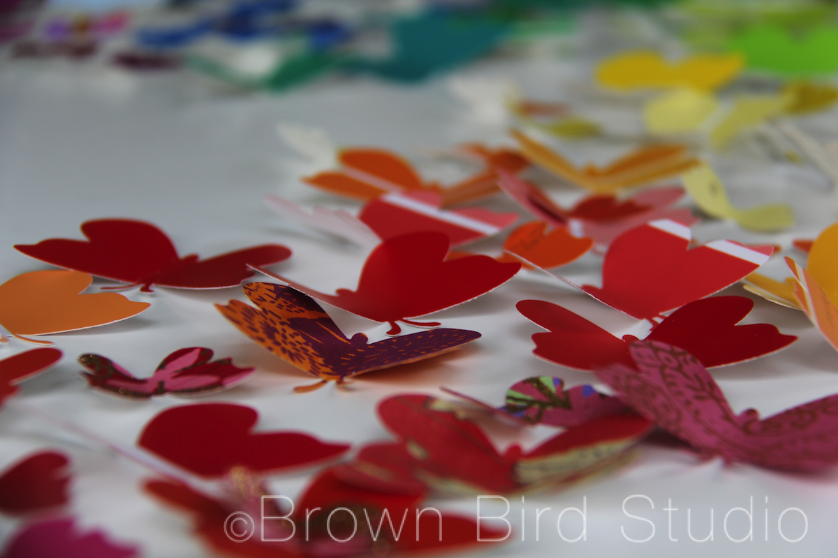
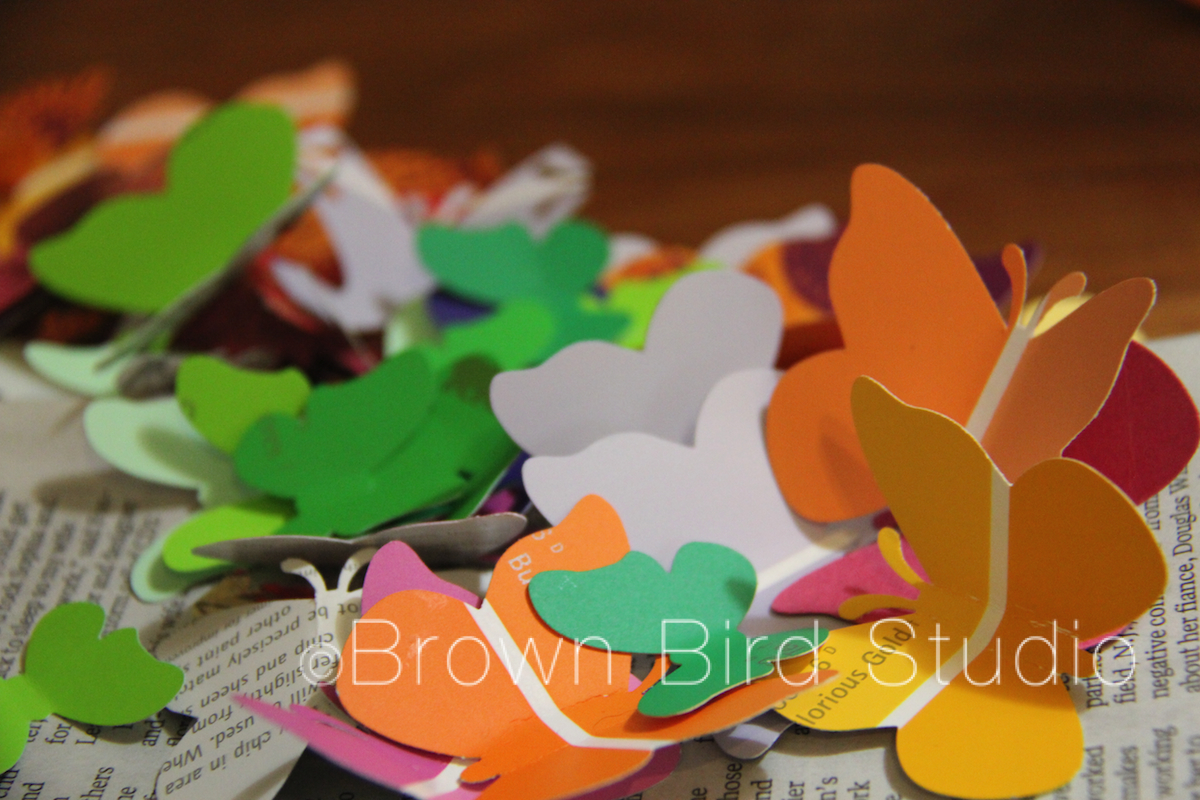 We used the paint samples you can get at hardware stores. Home Depot was kind enough to let us have a big handful of samples for free. The girls picked out the colors, punched the shapes with paper punches and bent the wings to make the butterflies look three dimensional. We also used some leftover pieces of printed papers I had lying around, to add variety.
Next we worked together to come up with the swoosh shape and I glued them onto a large piece of foam core. I wanted to use a large stretched canvas, painted white, but my supply budget for the summer wouldn’t stretch quite that far and I didn’t feel like stretching my own canvas. You could also use a piece of nice 1/4 inch birch plywood with sanded edges … maybe leave the natural wood color, or paint with white acrylic or indoor wall paint.
 We used Craft Glue to attach the butterflies to the foam core. I thought about using hot glue but decided it would be too messy and overkill, since the little butterflies are so lightweight.
We have a rainbow thing goin’ on in this butterfly swarm, but we could as easily have chosen to use a different color scheme. You could even do an “ombre” design — the great thing about paint samples — there are so many colors, and if you get the sample cards that have 4 or 5 shades of color on each, well that would be just easy!
Glue or stick some hangers on the back and voila! You have a colorful work of happy art. Total cost for this project: $3.00 (I already owned the paper punches. These are expensive, but maybe find someone who would lend you theirs … or plan to spend many evenings hand cutting hundreds of shapes.)
Supply List: craft glue, foam core (stretched canvas or 1/4 inch plywood panel may also be used), lots of paint sample chips, paper punches, one or two picture hangers for the back

Ema and Adia are spending lots of time with me this summer, just chillin, havin fun, learnin some stuff and makin some art. So far, I think we are using this first week to get used to each other, test limits, and figure out what we want to do for the rest of the summer. It’s been interesting and … I am very tired each evening. I think they might be too. I think that is a good thing.
I promised the girls I would teach them how to make blog posts, so every once in awhile Ema and/or Adia will be a guest blogger here on Water::Earth::Wind::Fire. I hope you enjoy their posts. At first, I will take dictation, typing pretty much exactly what they tell me to type. At some point, I will let them do the entire post. So, here goes, with the girls’ first ever blog post….

Ema writes:
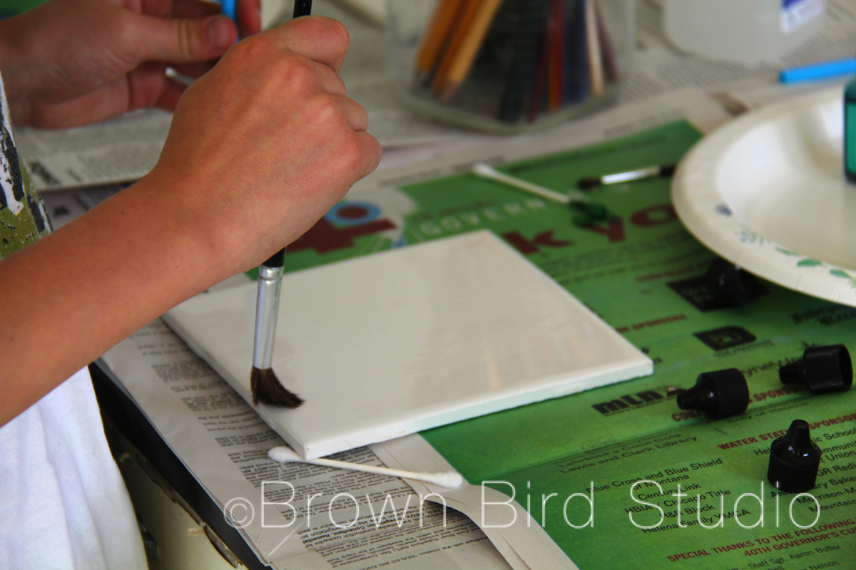
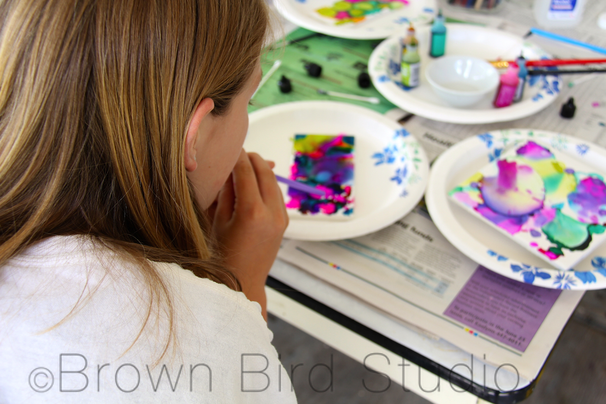
We wanted to make something nice for my mom’s office, so we made these tiles. We saw these on Pinterest, and we saved them to our summer fun Pinterest board and this is one of the projects my sister and I both wanted to do this summer. This was a creative and fun project. I would recommend this to children and their parents. To do one tile it takes about 5 minutes. Well, after you get everything set up, it goes really fast.
We made practice tiles first and my favorite one turned out to be my practice tile (that’s my practice tile, below.) It was my favorite because it had a lot of bright, different colors. I would describe the design as 3 different colored wax seals (like the ones on old envelopes) laying on top of each other. I really like that.
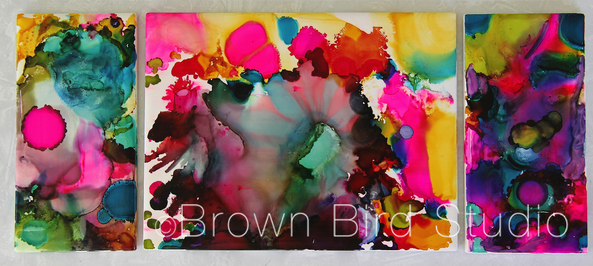
Here are the three tiles Ema made to go together as a triptych:
Editor’s note: Ema’s sister, Adia, made the list of supplies and wrote the instructions below:


Above is Adia’s finished triptych of tiles for her mom’s office. Adia writes:
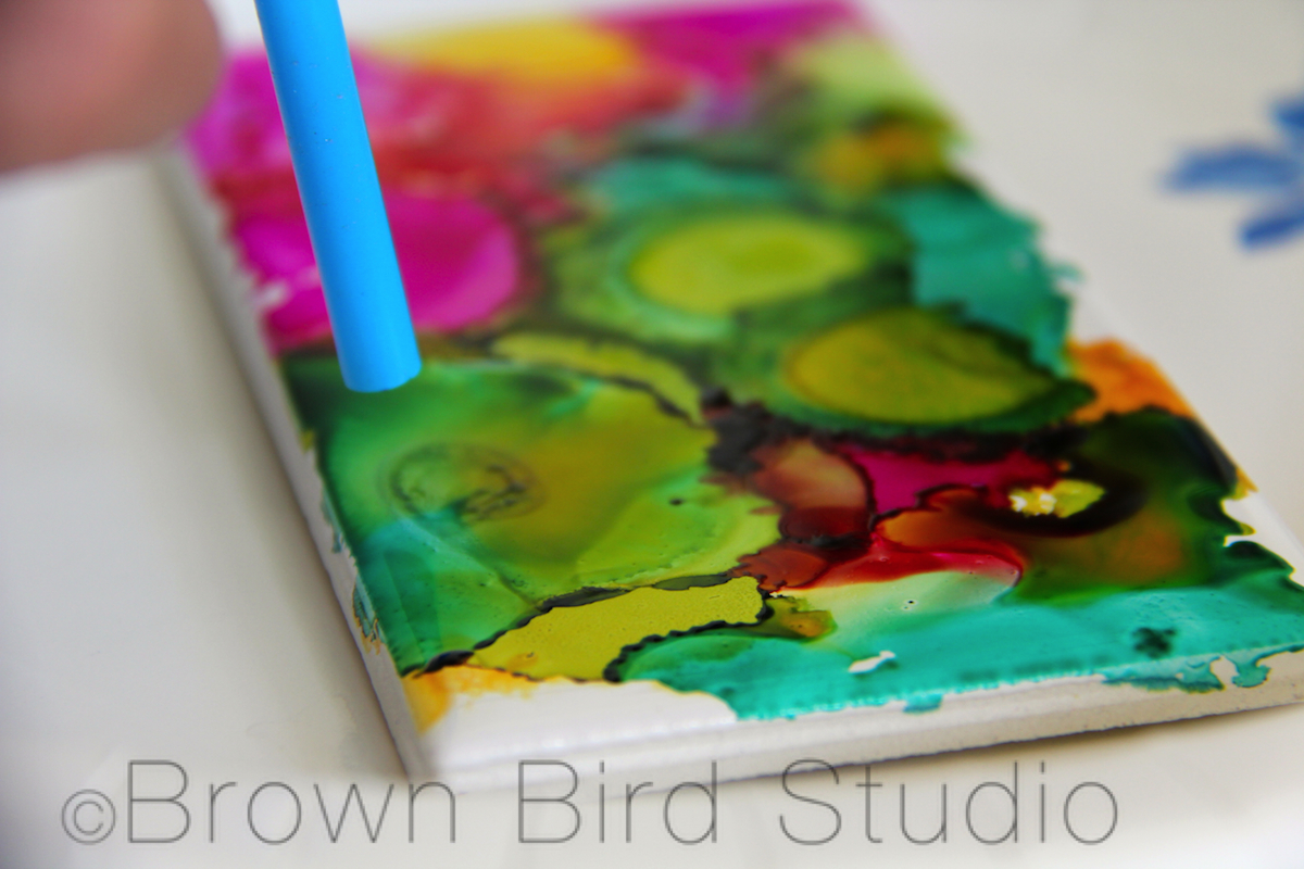
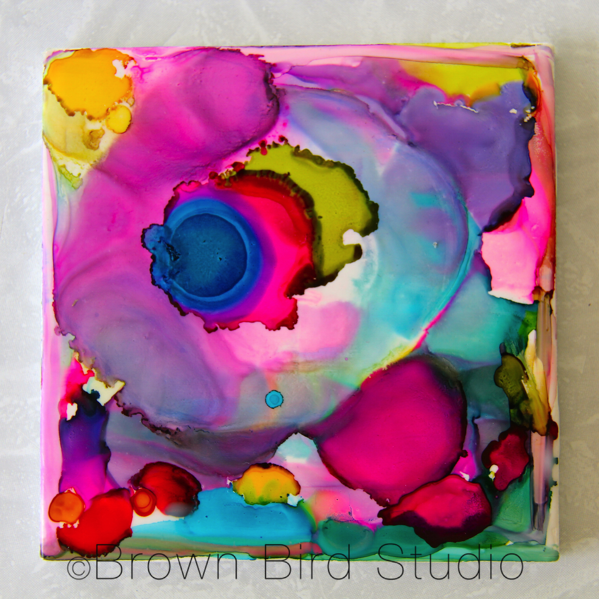
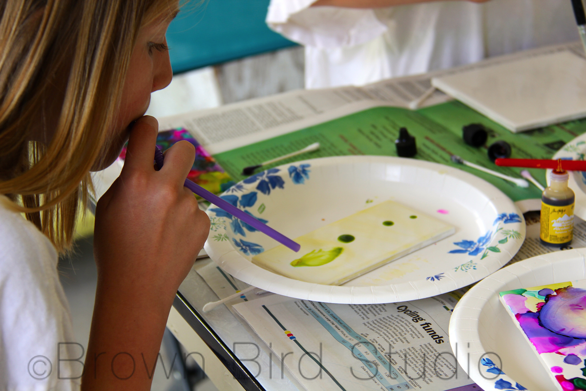
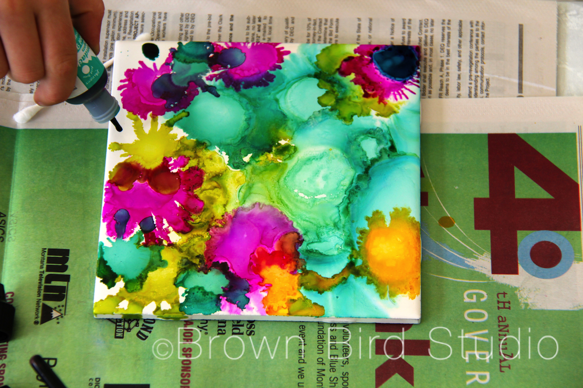
My favorite part of making the tiles was Strawmania. That is what you do with a bendy straw when you blow through it onto the tile. It expands the ink blobs. You can blow colors together and mix them. Sometimes the color goes wherever it wants to go, which looks cool sometimes and other times it makes a big grey blob. If you get a gray blob, you can always add more alcohol and then add another color to make it colorful. That fixes it. This is something I will probably want to do again. Next time I will use less colors so my tiles don’t get big gray blobs. Here is my favorite tile (below). I am squirting the ink on it:
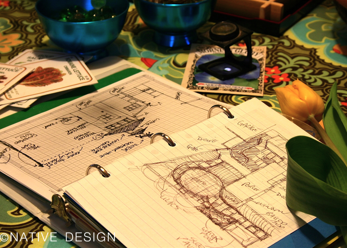
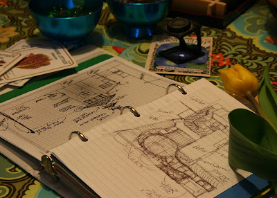
 I’ve kept a separate notebook or journal for my garden for years. Off and on. I’m not as disciplined as I’d like to be about keeping track of what is planted where; which plants are blooming when; what I’ve spent on the garden … or where I bought my materials, pots, and other stuff.
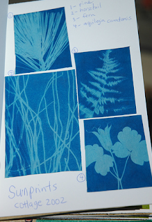
Sometimes my garden journal is just a few pages in my regular sketchbook or journal. For the last few years, I’ve used a smallish 3-ring binder pages I have customized and punched to fit. I use different kinds of paper depending on what I’m recording on it: graph paper for recording my veggie plots and for sketching ideas for construction projects. Heavy sketch paper for botanical and nature sketches and for just doodling ideas. Vellum envelopes with holes punched in them, for keeping plant labels and other odds and ends (receipts, etc)… plastic sleeves with 3-holes, these are handy for seed packets, photos, loose seeds, etc.
I have my journal divided into sections with pocketed dividers – the pockets come in handy for keeping loose stuff. If you make your own journal, you can make sections to fit the kind of information you want to keep about your garden. Here are some ideas for record-keeping and inspiration:

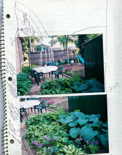 photos and/or sketches to document what’s growing throughout the year. I pair the photos with sheets on the individual plants. I also have a section for just beautiful photos of my garden
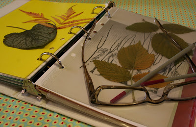
some links:
 lots more information about materials you’ll need and how to get started –they even have some templates you can download for plant record-sheets
 Bitter Betty: I love her sense of humor and highly recommend this blog post. Will her garden ever sit up and pay attention?
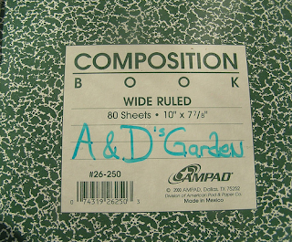 Journaling Life has some good links to resources, along with ideas for what to keep in your garden journal. Thank you to Denise, Leslie, Gayla, Lisa and BitterBetty
I collect images, mostly with my own camera, but also from old manuscripts, ephemera, found objects, cultural flotsam and jetsam. Sometimes I do digital collage, other times I work with paper, paint, drawing tools and glue in 2 dimensions or I make 3D mixed media sculptures. I work in layers, often more than twenty or thirty layers, as I am trying to create something with visual, symbolic and spiritual depth. The stories of the objects I use are glued into the collage layers. Emotions, connections, poetry, unspoken words, events, songs, dreams and spiritual meaning are embedded in there too. Often the layering will only be apparent on a subtle level. What’s important to me is that I know the layers are underneath somewhere, giving the piece personal depth and intimacy.

When I am looking at one of my own art pieces or someone else’s, I tend to judge it based on first my emotional response, then on the craftsmanship of the execution and finally based on some intellectual understanding of the piece. Sometimes I want my work to be wild and spontaneous and passionate. Other times I’m aiming for an almost cool control, which in itself can convey an experience or an emotion as effectively as a more passionate piece. It’s hard to say what makes a piece of art “work” for me. It’s intuitive. Can I connect with something the artist was trying to say? Or does it leave me cold? Really, it’s such a personal thing … one viewer may respond positively to a piece that another person thinks is boring.

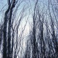
Here’s a little about my altered photograph (above.) The main image I used was of the lower trunk of a tree. When I first saw the tree, the roots looked like they were twining together in a Celtic knot shape. I have some background in fiberarts and weaving, and I thought of trying to bring out this aspect of the roots — that they were threaded and knotted together, not only around each other, but around the rocks and pebbles on the lake shore and down into the earth, around the leaves and soil and micro-organisms that live down there. I wanted to make something that looked like a tapestry, like threads and cords and knots, textural and subtle and fine.
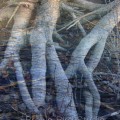
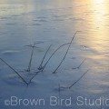
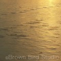
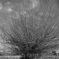
I used Photoshop to alter the tree roots photo by blending it with a photo of the frozen lake surface and another, of branches against sky. When I am doing this work, I choose photos based on their dominant shapes, lines and textures. For example, to create the look of a tapestry, I needed lots of texture, so I chose photos with lots of different line weights and shapes going on. The different textures of these three photos contribute to the feeling of woven cloth. Likewise, if I had been going for a minimalist feeling, I might have chosen only photos with simple shapes and few lines.After I played around with the colours and blended the three main photos, I rotated multiple copies of the image and blended many layers to make something like a tapestry with the appearance of depth and criss-crossing threads. I like that it’s not perfectly symmetrical … very much like my actual woven tapestries used to turn out.
I put together an album of images I used in the two pieces, Ghost Roots Tapestry and Woodland and Icon with Cross. You can see it here. I call this group of images, Dead of Winter. Sometimes I come up with a title for a series that almost contradicts how I really feel about the subject of the series. Yet to me, it fits. I hope the title makes people stop and read it twice, to puzzle out why I might have chosen those words. 
In this case, dead is the opposite of what I think winter is. Winter is very much alive — it is just sleeping; it is the Earth dreaming, growing secretly underground, holding the light of short winter days in her heart, in her belly, holding it in until everything is ready to leap out again, be born, and come back to the warmth and the air and the green. It is a time for meditation, concentration, inner-focus, silence and dreams and spiritual contemplation. With that in mind, I tried to bring out the subtle, quiet spirit of leafless trees, frozen water, and strong, connected roots.
Not all of the photos in this group are altered. In fact, some are just as they came out of my camera. But they all belong together because of the thread of winter-quiet.
All images: © 2005 – 2008 Maureen Shaughnessy. All rights reserved